Category : 7th Class
ADVERTISEMENTS GRAPHS/IMAGES
DEFINITION
Advertising brings a product (or service) to the attention of potential and current customers. Advertising is focused on one particular product or service. Thus, an advertising plan for one product might be very different from that for another product. Advertising is typically done with signs, brochures, commercials, direct mailings or e-mail messages, personal contact, etc.
Advertising is the activity of drawing public attention to a product or service in order to encourage people to buy it.
CREATING AN ADVERTISEMENT
It seems very difficult to craft a perfect advertisement to entice potential consumers or influence public opinion.
But the right way to make a good advertisement is to keep simple. An ad sums up everything that is smart, innovative, and distinguished about your brand, and is almost indispensable in today's economic marketplace.
WRITING THE ADVERTISEMENT
Advertisers create ads for an intended audience. They have a purpose behind designing an advertisement and publishing it in a particular way. Advertising affects people in different ways. People today are exposed to a large amount of advertising.
A catchy, snappy tagline is the sole of an advertisement. Keeping short and sweet within six or seven words might serve the purpose. Loud sounding advertisements appeal less to our senses. The immediate purpose of advertisement is to garb the consumer's attention and convince him or her that your product is different from others.
AVOID THE SAME OLD CLICHES
Being memorable is the key to good advertisement. Avoid terms like-new and improved, guaranteed, or free gift-is there any other kind?
These include:
Adults will be more discerning and respond to quality, sophisticated humour, and value.
While the whole point of making your slogan different is to think out of the box, there are a few basic things that need to be kept in mind.
LANGUAGE IN ADVERTISING
In advertising nothing is left to chance - definitely not the choice of words!
There are a number of effective ways to plant messages firmly into customers' brains, here are some of them:
(1) POWER OF THREE - THE TRIPARTITE MOTTO
Hendiatris (Greek for one through three) is a figure of speech used for emphasis, in which three words are used to express one idea.
The certainly most common "tool" of any kind of advertising (commercial, political, rhetorical,...).
Later brain research proves that the human brain tends to organise information into groups of three.
Example: Grace - Space - Pace (Jaguar)
(2) QUOTATIONS
Sayings of famous people or quotes from literary works are frequently implemented into advertising.
Sometimes directly, sometimes slightly altered.
Example: Veni, vidi, Visa (adapted from Cesar, veni, vidi, vici!)
(3) IMPERATIVES, COMPARATIVES,
QUESTIONS
Grammatical structures are also included in the tool-box of advertisers.
Example: Obey your thirst! (Sprite)
No battery is stronger longer! (Duracell)
What else? (Nescafe)
(4) SIMPLIFICATIONS/ABBREVIATIONS
Advertisers are rather creative when it comes to making speech easier and shorter.
Example: I'm lovin it!, Toys 'R' Us
(5) RHYME/ALLITERATION
Speech patterns like these are used to make slogans even more memorable. An alliteration is a sequence of words that all start with the same letter.
Example: 02 can do!, Snickers satisfies!
(6) SURPRISE/PROVOCATION
The unexpected is always a successful way to be remembered.
Example: You don't have to be silly to drink TK, but it helps! (Taylor Keith, red lemonade)
Geiz ist geil! / !
GRAPHS
Graphs, charts, and tables are ways of presenting information. Graphs and charts are pictures which show numbers or figures, and tables are just rows and columns of information.
This is a table. It shows the population of the world's top ten cities in 2011.
|
1 |
Tokyo |
Japan |
32,450,000 |
|
2 |
Seoul |
South Korea |
20,550,000 |
|
3 |
Mexico City |
Mexico |
20,450,000 |
|
4 |
New York City |
USA |
19,750,000 |
|
5 |
Mumbai |
India |
19,200,000 |
|
6 |
Jakarta |
Indonesia |
18,900,000 |
|
7 |
Sao Paulo |
Brazil |
18,850,000 |
|
8 |
Delhi |
India |
18,680,000 |
|
9 |
Osaka/ Kobe |
Japan |
17,350,000 |
|
10 |
Shanghai |
China |
16,650,000 |
One of the most important things to do is get the main idea of the graph. First, identify the main features of the graph. What is happening? What are the biggest numbers? If it is a time graph, what are the biggest changes? What are the trends?
Ideally you need to find one main idea and, if possible, one or two smaller ideas.
Study the graph below. Print it out. Write on it. Circle the important points - beginnings, endings, sudden changes, low points, high points, trends, averages, differences between lines, differences over time.
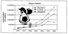
The graph shows US sports players' salaries in dollars. In 1970, baseballers earned $125,000 a year, footballers' salaries averaged $99,000 a year, and basketball players earned about $43,000 annually.
Main ideas
GROUPING INFORMATION
Sometimes there is just too much information in a graph. You may need to group information. Grouping information means putting two or three similar or related things together.
This makes it easier for the reader to understand. It is also less work for you, because you can put more than one piece of information in a sentence.
MAKE GROUPS
For example, you might be able to divide a list into three groups. Often there is one group at the top, one in the middle, and one at the bottom. Look at the graph below, which shows the number of Internet users in European countries in 2000.
Number of Internet Users per 100 people
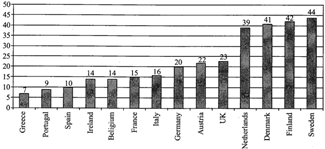
Possible groups could be:
CONSTRUCTING GRAPHS
Purposes
Graphs are:
Structure
Any graph used to report findings should show:
It is good practice (but only a convention) to put the dependent variable on the horizontal (x) axis and the independent on the vertical (y) axis.
BAR GRAPHS
Bar graphs should be used for categorical, ordered, and discrete variables. If the number of units in a discrete variable is large it may be displayed as a continuous variable.
LINE GRAPHS
Line graphs should be used for continuous variables.
PIE GRAPHS
Pie graphs (sometimes called pie or circle charts) are used to show the parts that make up a whole. They can be useful for comparing the size of relative parts. Because it is difficult to compare different circle graphs, and often hard to compare the angles of different sectors of the pie, it is sometimes better to choose other sorts of graphs.
HISTOGRAMS
Use histograms when y-axis gives the frequency of, or occurrences for continuous data that has been sorted into groups, for example, 20-24 metres. All bars are usually of equal width. They can be turned into line graphs by connecting the middle of the top section of each vertical bar. Histograms are not joined up bar graphs and should not be used for categoric data (unless the number of units in each group is large)
WHAT A GRAPH CAN TELL YOU
On a graph you get an overall shape of a variable or the relationships between variables.
A line graph represents a numerical or mathematical relationship and so has more information "buried" in it than other graphs.
Line graphs can sometimes be used to make predictions for values that were not measured, by interpolating or extrapolating the trend, or by looking at the shape.
Limitations
|
GRAPHS: VOCABULARY Movement (Verbs) Up |
|
|
· Rose |
· Went up |
|
· Increased |
· Grew |
|
· Shot up |
· Surged |
|
· Rocketed |
· |
|
Movement (Verbs) Down |
|
|
· Fell |
· Declined |
|
· Dropped |
· Decreased |
|
· Sank |
· Went down |
|
· Plunged |
· Plummeted |
|
Prepositions |
|
|
· Between 1995 and 2000 |
· From 1995 to 2000 |
|
· Sales rose from 200 to 250 |
· Sales fell to 150 in March |
|
· Sales fell by 50% |
· |
|
Adverbs and Intensifiers |
|
|
· slightly |
· a little |
|
· a lot |
· sharply |
|
· gradually |
· steeply |
|
· steadily |
· gently |
|
No Movement (Verbs with Adjectives, Verbs) |
|
|
· remained steady |
· were unchanged |
|
· did not change |
· remained constant |
|
· remain stable |
· stabilised |
|
Tops and Bottoms |
|
|
· reached a peak |
· peaked |
|
· reached their highest level |
· fell to a low |
|
· sank to a trough |
· reached a bottom |
Example:
Passengers at a London Underground Station
London Underground station passengers
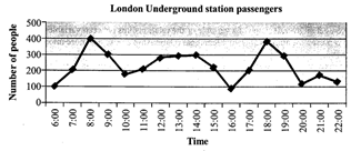
The graph shows the fluctuation in the number of people at a London underground station over the course of a day.
The busiest time of the day is in the morning. There is a sharp increase between 06:00 and 08:00, with 400 people using the station at 8 o'clock. After this the numbers drop quickly to less than 200 at 10 o'clock. Between 11 am and 3 pm the number rises, with a plateau of just under 300 people using the station.
In the afternoon, numbers decline, with less than 100 using the station at 4 pm. There is then a rapid rise to a peak of 380 at 6pm. After 7 pm, numbers fall significantly, with only a slight increase again at 8pm, tailing off after 9 pm.
Overall, the graph shows that the station is most crowded in the early morning and early evening periods.
The Vocabulary of Numbers
There are some special words for numbers, fractions and percentages.
Look at the following table which shows a number in different years (1990-1995):
1990 1995
1200 1800
You could describe the above table using numbers, fractions or percentages:
1992 1994 1996 1998
500 1000 3000 12000
Use "trebled," "-fold, "and "times:"
1992 1994 1996 1998
1000 800 400 100
Use Fractions:
Vocabulary Tips
TYPES OF GRAPHS
The vocabulary for each kind of graph is different:
In time graphs you use time vocabulary to describe change: rose, fell, declined, shot up, increased, remained steady, etc.
In comparison graphs you compare: twice as much as, more than, less than, the same amount, both X and Y have the same figure, etc.
Time Graphs
Example:
Here is a time graph.
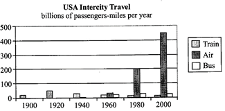
You have to compare different methods of transport used in the US over the last century - train, bus and air.
You could start with:
The main trend with rail transport is that it rose to a peak in the 1920s and 1930s and then declined.
The main trend with air is that it started late, in the 1960s, but it has shot up to become by far the biggest carrier of passengers.
Comparison Graphs
Example:
Here is a comparison graph.
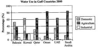
You have to compare the amount of water used for domestic, agricultural and industrial purposes.
There are two ways to write about this graph:
If you decide to write by describing use, you could start with Agriculture because it is the biggest user. Group together Saudi Arabia and Oman as the top users, and then group UAE and Qatar as the middle group of users, using 60% of water for agriculture. Finally mention Bahrain and Kuwait.
Your second paragraph should be about Domestic use, the use of water in the home, because it is the second biggest use. Start with Kuwait and Bahrain (grouped together) (more than 50%) and then write about Qatar and the UAE.
Before you Begin
Underline key words. Write related words - turn nouns into verbs, verbs into nouns, adjectives into adverbs, etc. Write opposite words, similar words, synonyms, etc. Circle and highlight the graph. Use arrows. Make notes. Circle the biggest, the smallest, stable or unchanging parts, sudden increases, etc.
Identify trends. A trend is the overall idea of the graph
While you Write: Layout
Introduction
Paragraph 2: Trend 2
While You Write: Some Don'ts
Word Length and Sentence Length
Make sure you have 150 words. You should have some short sentences (about 6-10 words) and some long ones (12-18) words, but your average should be about 12 or 13 words per sentence.
A sentence without a number will usually be short. Use a mix - a sentence without a number followed by a sentence or two with a number.
IMAGES
The word image is in the broader sense means any two-dimensional figure such as a map, a graph, a pie chart, or a painting. In this wider sense, images can also be rendered manually, such as by drawing, the art of painting, carving, rendered automatically by printing or computer graphics technology, or developed by a combination of methods, especially in a pseudo-photograph.
A volatile image is one that exists only for a short period of time. This may be a reflection of an object by a mirror, a projection of a camera obscura, or a scene displayed on a cathode ray tube. A fixed image, also called a hard copy, is one that has been recorded on a material object, such as paper or textile by photography or any other digital process.
A mental image exists in an individual's mind, as something one remembers or imagines. The subject of an image need not be real; it maybe an abstract concept, such as a graph, function, or "imaginary" entity. A still image is a single static image, as distinguished from a kinetic image. This phrase is used in photography, visual media and the computer industry to emphasise that one is not talking about movies, or in very precise or pedantic technical writing such as a standard.
Our ancestors used pictures and images to communicate. The advertising world has always relied on powerful imagery to tell a marketing story and then there is that old saying: "A picture is worth a thousand words".
Proper Usage of Images
Obviously this growing trend means we need to use visuals to do more of the talking for us. But along with this growing popularity is the proper usage of images in your marketing efforts. Here are five usage guidelines for you to consider.

Description: This advertisement shows a simple grey car in a grey background. The big words say, "The Only One You'll Need." The smaller text says, "Experience the freedom and peace of mind knowing you've made a great investment. Essentially, you are buying a car for life. Twenty years from now it will still get you from point A to B."
Interpretation: It seems that the message is clear that this car will last a long time. The text, "Experience the freedom and peace of mind knowing you've made a great investment," seems to speak to older people who think responsibly about their purchases. It seems to say that this is the smart thing to do. Also, when it says that it gets you from "Point A to B" seems to mean that the most important consideration in buying a car is reliability Because of this, this ad is definitely meant for older people (age 50+).


You need to login to perform this action.
You will be redirected in
3 sec