Pie Chart
Category : 9th Class
A pie chart is the pictorial representation of the given data with the help of non intersecting sectors of different areas and different central angles. The magnitude of the central angles depend on the magnitude of the data. In a pie chart, the arc length of each sector (and consequently its central angles and area), is proportional to the quantity it represents. When angles are measured with 1 turn as unit then a number of percent is identified together with the same number of turns. The sectors create a full disk. It is named for its resemblance to a pie which has been sliced. The earliest known pie chart is generally credited to William Play fair's Statistical Breviary in 1801.
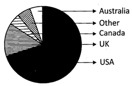
Pie chart of populations of English native speakers
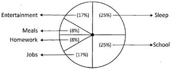
![]() The data in the table represents the percentage of hours of the day spent by the individuals on various activities of the day. Give the pictorial representation of the data given below:
The data in the table represents the percentage of hours of the day spent by the individuals on various activities of the day. Give the pictorial representation of the data given below:
| Activity | Hours | Percent of Day |
| Sleep | 6 | 25 |
| School | 6 | 25 |
| Job | 4 | 17 |
| Entertainment | 4 | 17 |
| Meals | 2 | 8 |
| Homework | 2 | 8 |
The Pictorial Representation of the Data given above in the Table
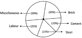
Calculation of Central Angles
| Item | Expenditure | Central Angle |
| Brick | 20 | \[(20/100\times 360)\] |
| Cement | 10 | \[(10/100\times 360)\] |
| Steel | 15 | \[(15/100\times 360)\] |
| Labor | 25 | \[(25/100\times 360)\] |
| Miscellaneous | 30 | \[(30/100\times 360)\] |
Steps of Constriction

![]()

Answer the following question based on the graph given on previous page:
![]() In the bar graph given in example, student?s favorite activity after school is:
In the bar graph given in example, student?s favorite activity after school is:
(a) Talk on Phone
(b) Visiting Friends
(c) Earning Money
(d) Play Sports
(e) None of these
Answer: (b)
![]() According to the bar graph which is the least favorite activity after school?
According to the bar graph which is the least favorite activity after school?
(a) Talk on Phone
(b) Visiting Friends
(c) Earning Money
(d) Play Sports
(e) None of these
Answer: (e)
![]() Which two activities are favored equally by the students?
Which two activities are favored equally by the students?
(a) Playing sports and earning money
(b) Using the computer and earning money
(c) Talking on the phone and playing sports
(d) All of these
(e) None of these
Answer: (a)
![]() There are several histograms as shown below, find which one of the following represents the histograms of the data given in the table below?
There are several histograms as shown below, find which one of the following represents the histograms of the data given in the table below?
| Class Interval | Frequency |
| 0 - 5 | 4 |
| 5 - 10 | 10 |
| 10 - 15 | 18 |
| 15 - 20 | 8 |
| 20 - 25 | 6 |
(a) 
(b) 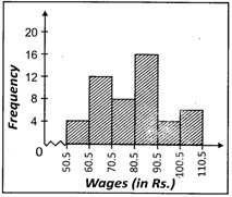
(c) 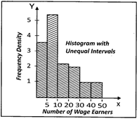
(d) All of these
(e) None of these
Answer: (a)
Explanation:
In the above examples, the intervals are exclusive.
![]() The daily wages of 50 workers working for a factory is given below: In table (i) the class intervals are inclusive. So we convert them to the exclusive form as shown in table (ii).
The daily wages of 50 workers working for a factory is given below: In table (i) the class intervals are inclusive. So we convert them to the exclusive form as shown in table (ii).
(i)
| Wages (In Rs.) | Frequency |
| 51 - 60 | 4 |
| 61 - 70 | 12 |
| 71 - 80 | 8 |
| 81 - 90 | 16 |
| 91 - 100 | 4 |
| 101 - 110 | 6 |
(ii)
| Wages (In Rs.) | Frequency |
| 50.5 - 60.5 | 4 |
| 60.5 - 70.5 | 12 |
| 70.5 - 80.5 | 8 |
| 80.5 - 90.5 | 16 |
| 90.5 - 100.5 | 4 |
| 100.5 - 110.5 | 6 |
Which one of the following is the histogram of above given table?
(a) 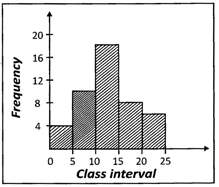
(b) 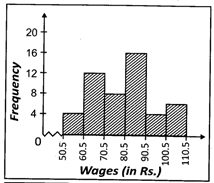
(c) 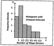
(d) All of these
(e) None of these
Answer: (b)
Exploration:
(i) The class intervals are made continuous and then the histogram is constructed.
(ii) A kink or a zig - zag curve is shown near the origin. It indicates that the scale along the horizontal axis does not start at the origin.
(iii) The horizontal scale and vertical scale need not be the same.
![]() Distribution of shops according to the number of wage - earners employed at a shopping complex is given below:
Distribution of shops according to the number of wage - earners employed at a shopping complex is given below:
| Number of wage-earners | Number of shops | Frequency Density |
| Under 5 | 18 | 3.6 |
| 5 - 10 | 27 | 5.4 |
| 10 - 20 | 24 | 2.4 |
| 20 - 30 | 20 | 2.0 |
| 30 - 50 | 16 | 0.8 |
Illustrate the above table by a histogram, showing clearly how you deal with the unequal class intervals
(a) 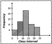
(b) 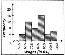
(c) 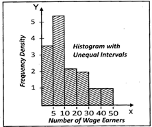
(d) All of these
(e) None of these
Answer: (c)
Explanation:
When the intervals are unequal, we construct each rectangle with the class intervals as base and frequency density as height
\[\text{Frequency density}=\frac{\text{Frequency of the class interval}}{\text{Class size of the interval}}\]


You need to login to perform this action.
You will be redirected in
3 sec