Category : 4th Class
Data Handling
Learning Objectives
Introduction
Every day we come across a lot of information in the form of numerical figures, tables and graphs. These are provided by newspapers, televisions, magazines and other means of communication. These may relate to cricket batting or bowling average, temperatures of different cities, etc. The graphs are prepared with the help of data. Data are collected through survey or other means. Then data are arranged in ascending or descending order using table. In this chapter, we will study about graphs, how to make the graphs and how to extract information’s contained by the graphs.
Data
Collection of information’s in the form of numerical figures in a survey is called data. The initial data that observer collects himself are called raw data. To extract the information’s contained by the data are arranged in ascending or descending order using tables. The raw data that have been arranged or organized by constructing a table are called grouped data. Data can be represented graphically to give clear idea of what it represent. It is easier to interpret and organise data using pictorial representation. Some of the ways in which data can be represented pictorially are:
Bar Graph
A bar graph is a chart that uses bars to show comparisons between categories of data. It is an another type of graph used for showing data or information in a quick way. The bars can be either horizontal or vertical. Bar graphs with vertical bars are sometimes called vertical bar graphs. They are quite simple and easy to draw. Suppose the following data were collected regarding the number of employees in different companies.
|
Company |
Number of Employs |
|
Company A |
300 |
|
Company B |
700 |
|
Company C |
500 |
|
Company D |
400 |
|
Company E |
500 |
|
Company F |
800 |
|
Company G |
400 |
Let us draw a bar graph to depict this information.
Step 1: Draw a horizontal line OX and a vertical line OY, meeting at a point 0.
Step 2: Choose a convenient scale and along OX and OY, mark the points at equal intervals.
Step 3: Now, from the points taken along OX, draw the rectangular bars keeping width of the bars and distance between the bars equal. Lengths (heights) of the bars represent respective observations.
Step 4: Label these rectangular bars with the company they represent and shade the bars.
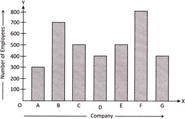
Clearly in the figure shown above, 3 units on OY represent 300 employes, 7 units represent 700 employes, and so on. Thus, we obtained the bar graph to depict the given information.
Line Graph
A graph which is drawn just with lines instead of pictures or bars is called a line graph. A line graph shows information that is connected in some way (such as change over time). Thus, a line graph is used to show gradual changes in the information.
Suppose, the following data we collected regarding the number of printers sold by Computer Mart over 6 months from January to June in a particular year.
|
Month |
Number of Printers |
|
January |
16 |
|
February |
18 |
|
March |
13 |
|
April |
16 |
|
May |
13 |
|
June |
17 |
Let us represent the above data on a line graph. To draw a line graph, first we need to draw two axes. Then, we need to write down what the graph is all about and write the information along the two axes. Now, we find the coordinates of the two axes and mark a dot (.) at their meeting point. After all the points have been marked, we join them to one another.
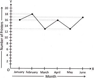
Clearly in the figure shown above, by reading the line that goes up and down, we can find out the information present on the line graph. In a line graph, the line may go up or down and sometimes up and down both.
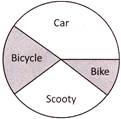
Pie Chart
A pie chart is a circular graph that uses "pie slices' to show relative sizes of data. In a pie chart, a circle is divided into the required number of parts or slices to give information. The size of each part of the circle depends on the size of information.
Suppose, we survey our friends to find the kind of vehicles they like most.
|
Car |
Bike |
Scooty |
Bicycle |
|
7 |
3 |
6 |
4 |
Here, we first divide the circle into 20 equal parts as the sum of 7, 3, 6 and 4 is 20. Now, 7 equal parts out of 20 is shown by car, 3 equal parts out of 20 is shown by bike, and, so on. We can show the data by the pie chart as given below:
Commonly Asked Question
Directions (1 - 3): Following pictograph tells us about the kind of books that Susan read.
|
Kind of Books Susan has read |
|
|
Drama |
|
|
Horror |
|
|
Health |
|
|
Travel |
|
|
Comics |
|
|
One |
|
Read the pictograph and answer the questions given below:
1. How many books on health, travel and comics did Susan read altogether?
(a) 54 (b) 45
(c) 36 (d) 63
(e) None of these
Answer (a) is correct.
Explanation: Number of books on health = \[5\times 6=30\]
Number of travel books = \[1\times 6=6\]
Number of comics books = \[3\times 6=18\]
Therefore, Susan read (\[30+6+18\]) = 54 books on health, travel and comics altogether.
2. How many more books are read by Susan on health than on comics?
(a) 6 (b) 10
(c) 12 (d) 15
(e) None of these
Answer (c) is correct.
Explanation: Number of symbols representing books on health = 5
Number of symbols representing comic books = 3
Difference in the numbers of symbols = \[5-3=2\]
Therefore, \[2\times 6=12\] more books are read by Susan on health than on comics.
3. How many books did Susan read in all?
(a) 80 (b) 96
(c) 90 (d) 102
(e) None of these
Answer (b) is correct.
Explanation: Sum of the numbers of all symbols = \[4+3+5+1+3=16\]
Therefore, Susan read (\[16\times 6\]) = 96 books in all.
Directions (4 - 6): Given bar graph tells us about the marks obtained by Rohit in five different subjects in a particular test.
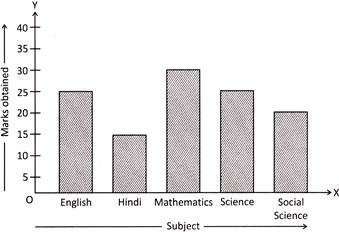
Read the bar graph and answer the questions given below:
4. In which subject Rohit scored more than 25 marks?
(a) English (b) Science
(c) Hindi (d) Mathematics
(e) None of these
Answer (d) is correct.
Explanation: Seeing the bar graph, we find that in Mathematics, Rohit scored more than 25 marks that is 30 marks.
5. If 20 were the passing marks, then in which subject did Rohit fail in?
(a) Social Science (b) Hindi
(c) English (d) Science
(e) None of these
Answer (b) is correct.
Explanation: Passing marks were 20 and Rohit scored 15 marks in Hindi. Therefore, Rohit failed in Hindi.
6. If 40 were the maximum marks in each subject, then how many marks did Rohit score in English, Mathematics and Science out of 120?
(a) 60 (b) 70
(c) 80 (d) 65
(e) None of these
Answer (c) is correct.
Explanation: Sum of marks scored in English, Mathematics and Science = \[25+30+25=80\]
Therefore, Rohit scored 80 marks out of 120 in English, Mathematics and Science together.
Directions (7-8): Given line graph tells us about Maria’s body weight in kilograms for 5 months.
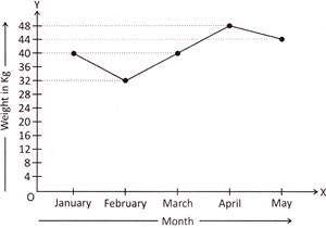
Read the line graph and answer the questions given below:
7. In which month, Maria's body weight was the lowest?
(a) January (b) February
(c) April (d) May
(e) None of these
Answer (b) is correct.
Explanation: Seeing the line graph, we find that the dot representing February is at the lowest, point 32.
Therefore, in February, Maria's body weight was the lowest that is 32 kg.
8. If 40 kg is the healthiest weight for Maria for her height, then in which two months Maria was the healthiest?
(a) January and February
(b) February and April
(c) January and March
(d) April and May
(e) None of these
Answer (c) is correct.
Explanation: The healthiest weight for Maria for her height is 40 kg.
Here, the dot representing January and March are at 40.
Therefore, in January and March, Maria was the healthiest.
Directions (9 – 10): Given pie chart tells us about the various tickets sold on a given day at a Theme Park in a city.
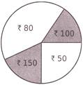
Read the given pie chart and answer the questions given below:
9. Ticket of what amount was sold the most?
(a) Rs. 50 (b) Rs. 80
(c) Rs. 100 (d) Rs. 150
(e) None of these
Answer (b) is correct.
Explanation: Seeing the pie chart, we find that the pie slice of circle representing ticket of Rs.80 is the biggest.
Therefore, ticket of Rs. 80 was sold the most.
10. How many tickets of Rs.50 were sold if the total collection by selling tickets of Rs.50 was Rs.11,250?
(a) 125 (b) 175
(c) 200 (d) 225
(e) None of these
Answer (d) is correct.
Explanation: Total collection by selling tickets of Rs.50 = Rs.11,250
The cost of one ticket = Rs.50
Therefore, the total number of tickets of Rs.50
\[=\frac{\text{Rs}\text{.11,250}}{\text{Rs}\text{.50}}=\frac{11250}{50}=225\]


You need to login to perform this action.
You will be redirected in
3 sec